The days of designing a website for a single desktop screen are over. Every website designed now should be compatible with all the available device platforms. As the percentage of people browsing through a phone has increased than on desktop, this making your website compatible with every device we call it as responsive website design. There are many website designers in Bangalore which offer such services; finding the best among all other website design company in Bangalore is a bit of tedious task.
Below we will see what exactly are RWD and Tips and tools in building RWD.
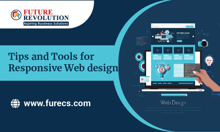
Responsive Web Design
Responsive web design (RWD) is an approach that allows design and code to respond to all the available sizes of a device’s screen, wherein the user gets optimal viewing experience.
The best responsive website uses flexible images, fluid grid and CSS styling for alteration.
Things to take care of:
User experience: We have to consider the user point of view while they are working on desktop and mobile, the content should be compatible
Design accordingly: Design your site around the content not with the latest mobile device
Engagement: Less is more, often the hierarchy is very important, especially on the mobile as we have limited space in mobile when compared to desktop, hence the way the user moves from one page to other in mobile should be very clear to make them understand what your site is about.
Flexible images: Scaling of images is really very important; you need to think about how the image will look on mobile vs. desktop screen? From a developer’s point of view, the code should be helpful and cross-platform compatible.
Tools:
Mobile this tool can be used for previewing your design n how it may look on mobile and look correct errors if found.
Web browser seems to be fun but yes, it is an important tool to use for preview and check your website appearance on the desktop.
Google resize to quickly preview your site across every possible device.
Media queries are code which will be implemented when your site is constructed, it helps the code to adapt to every size of the device
Fluid grids are designing a website layout on percentage values instead of set pixels.
Fit Text is a jQuery that will allow text to scale according to the device it is viewed on. It resizes text based on ratios and is intended for use with only headlines.
Fit Vid is a modern jQuery that is a cousin of Fit Text which will make your video adaptable to fluid designs using javascript and CSS.
Bootstrap: An extremely famous and important tool for framework in HTML, CSS, and JavaScript for building mobile-first, responsive design websites.
Future Revolution helps you in building such a responsive website for your business, making your business fit in every possible device and appear hassle less, be pocket and user-friendly.
To Know More:
- +91 8448449784 / 7760556363
- contact@furecs.com / marketing@furecs.com